70
50
Ten Gun’s work was better known than the agency itself. After 30 years, it was time to become more visible. The challenge was to give the agency a distinct presence while preserving its instinct to put clients first—and build an identity its people could carry forward.
#00665A
#1E2426
Full Flood
framed

1Up Paragraph + Pull Quote
Left
None
The original brief captured the challenge plainly: “You may not know us, but you definitely know our work.”
I was brought in to help narrow the direction and carry it through to a complete identity. By that point, the project had taken the brief into an exploration of mystery and the unknown. UAPs, Bigfoot and unexplained phenomena offered plenty of fun stuff to play with, but the direction behaved more like a campaign than a foundation to build an identity on.
Working sessions with leadership kept returning to the Ten Gun people remembered: the creative ambition, the way we worked together and the attention we gave clients. Those qualities gave us a basis for moving the identity forward.
We needed more than a campaign. We needed a foundation.
We needed more than a campaign. We needed a foundation.
The original brief captured the challenge plainly: “You may not know us, but you definitely know our work.”
I was brought in to help narrow the direction and carry it through to a complete identity. By that point, the project had taken the brief into an exploration of mystery and the unknown. UAPs, Bigfoot and unexplained phenomena offered plenty of fun stuff to play with, but the direction behaved more like a campaign than a foundation to build an identity on.
Working sessions with leadership kept returning to the Ten Gun people remembered: the creative ambition, the way we worked together and the attention we gave clients. Those qualities gave us a basis for moving the identity forward.
We needed more than a campaign. We needed a foundation.
The original brief captured the challenge plainly: “You may not know us, but you definitely know our work.”
I was brought in to help narrow the direction and carry it through to a complete identity. By that point, the project had taken the brief into an exploration of mystery and the unknown. UAPs, Bigfoot and unexplained phenomena offered plenty of fun stuff to play with, but the direction behaved more like a campaign than a foundation to build an identity on.
Working sessions with leadership kept returning to the Ten Gun people remembered: the creative ambition, the way we worked together and the attention we gave clients. Those qualities gave us a basis for moving the identity forward.
Statement
Large
None
Enough structure to hold together. Enough room to feel human.
Enough structure to hold together. Enough room to feel human.
Enough structure to hold together. Enough room to feel human.
Image + Copy
Left
None

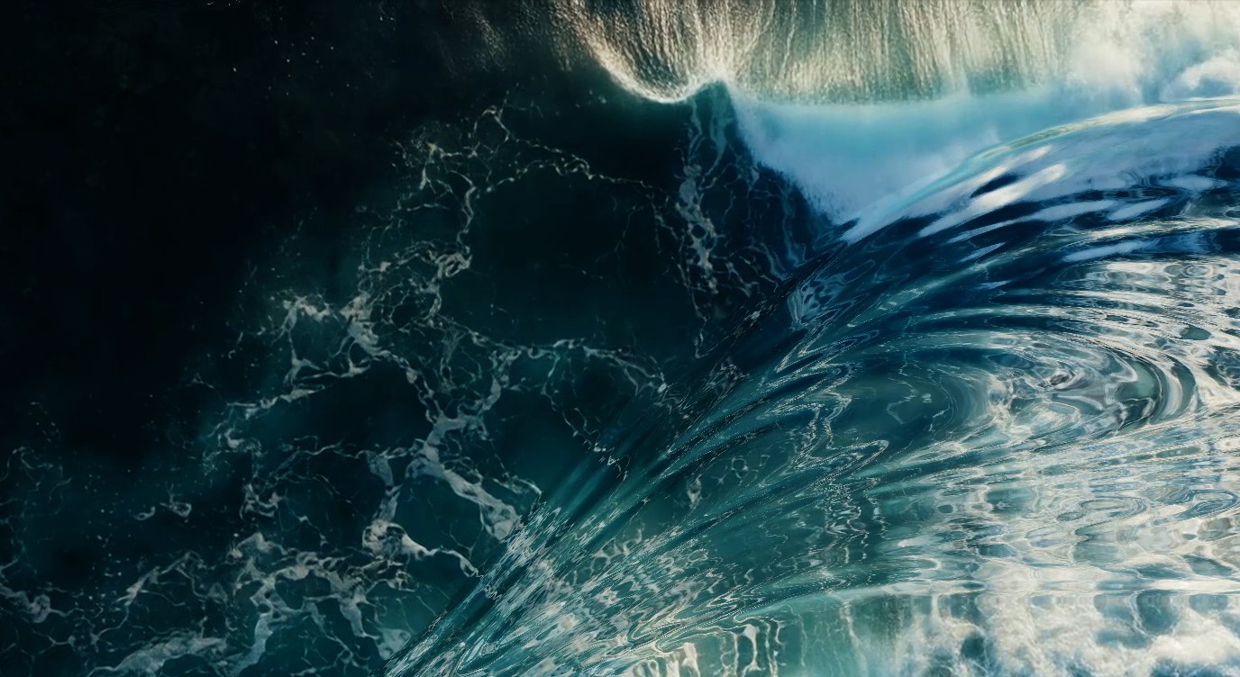
I moved away from overt references toward visual metaphors for how we worked. Gravitational waves offered a starting point: unseen forces with effects that travel far beyond their source. That felt appropriate for an agency whose work reached people who had never heard its name.
The direction presented to leadership had three layers. Resonance established depth through quiet patterns and dimensional backgrounds. Presence brought people into the identity through candid photography, with a film-like quality that favored the messy moments over the polished ones. Inflection proposed moments of tension through motion and distortion.
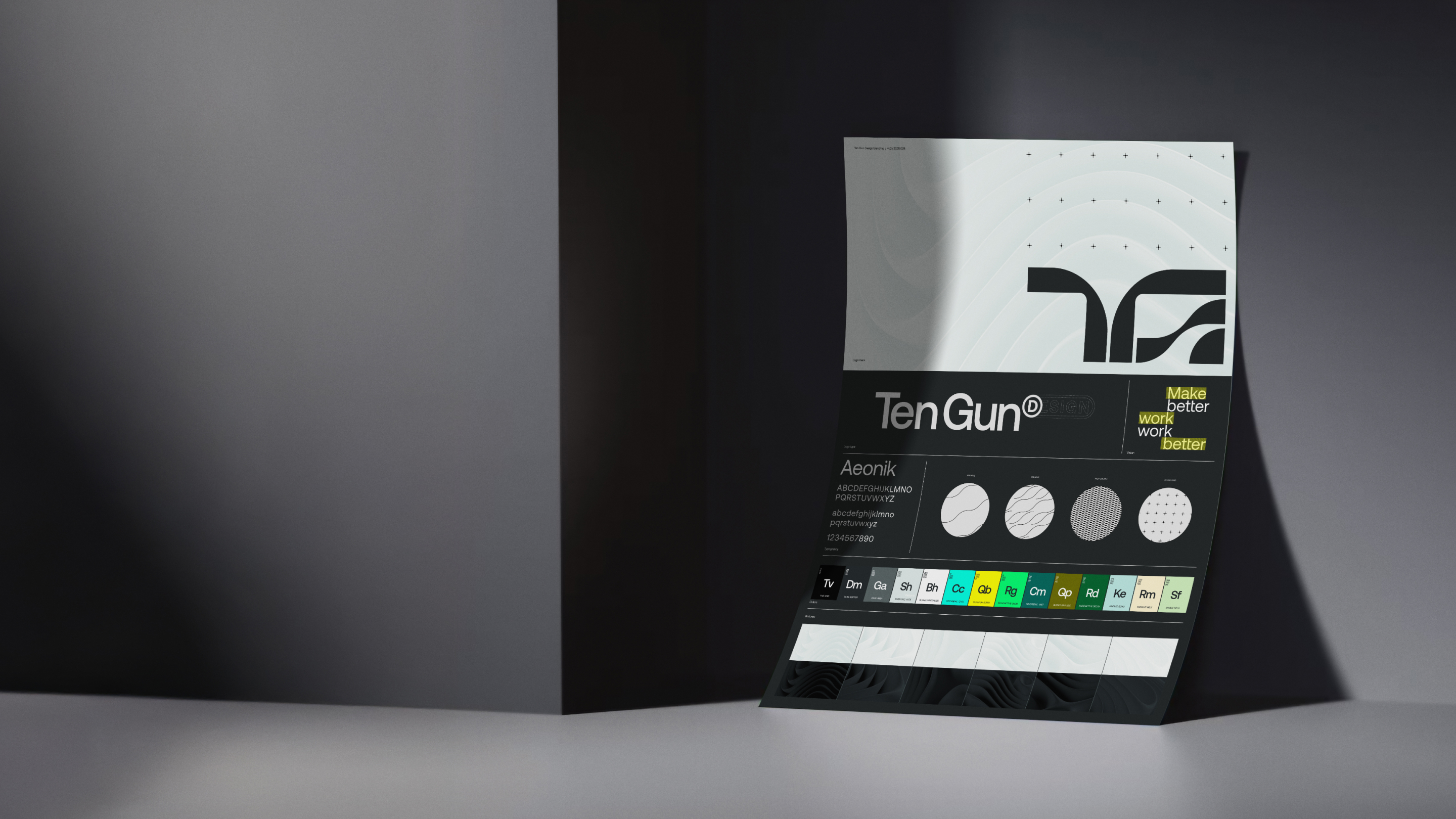
Those layers gave us a shared basis for evaluating design choices. Working with design and leadership, we developed the logo, color palette and typography alongside guidance for how people could use and build on them.
Full Flood
None
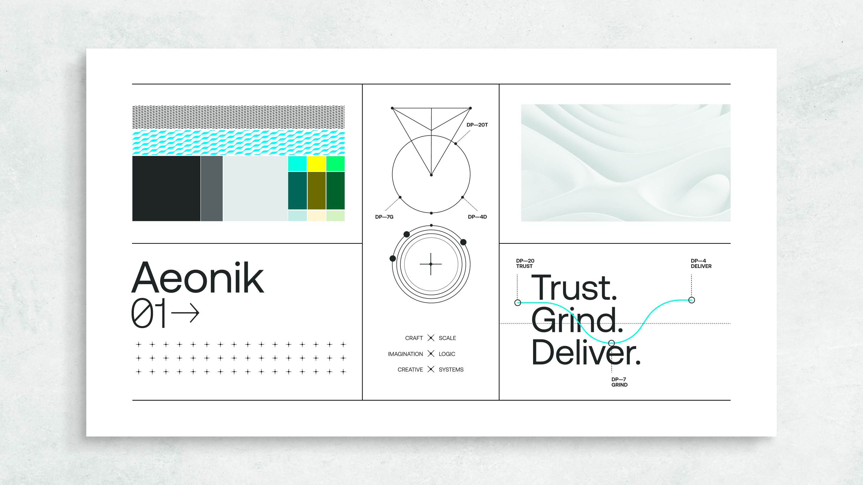
Image + Copy
Right
None

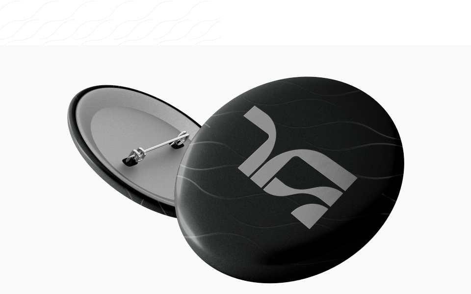
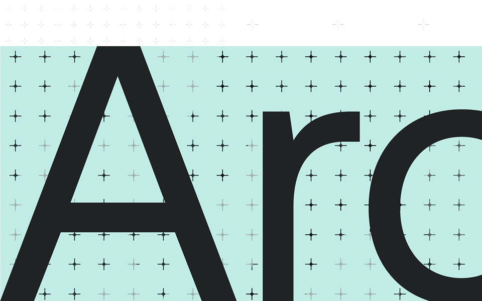
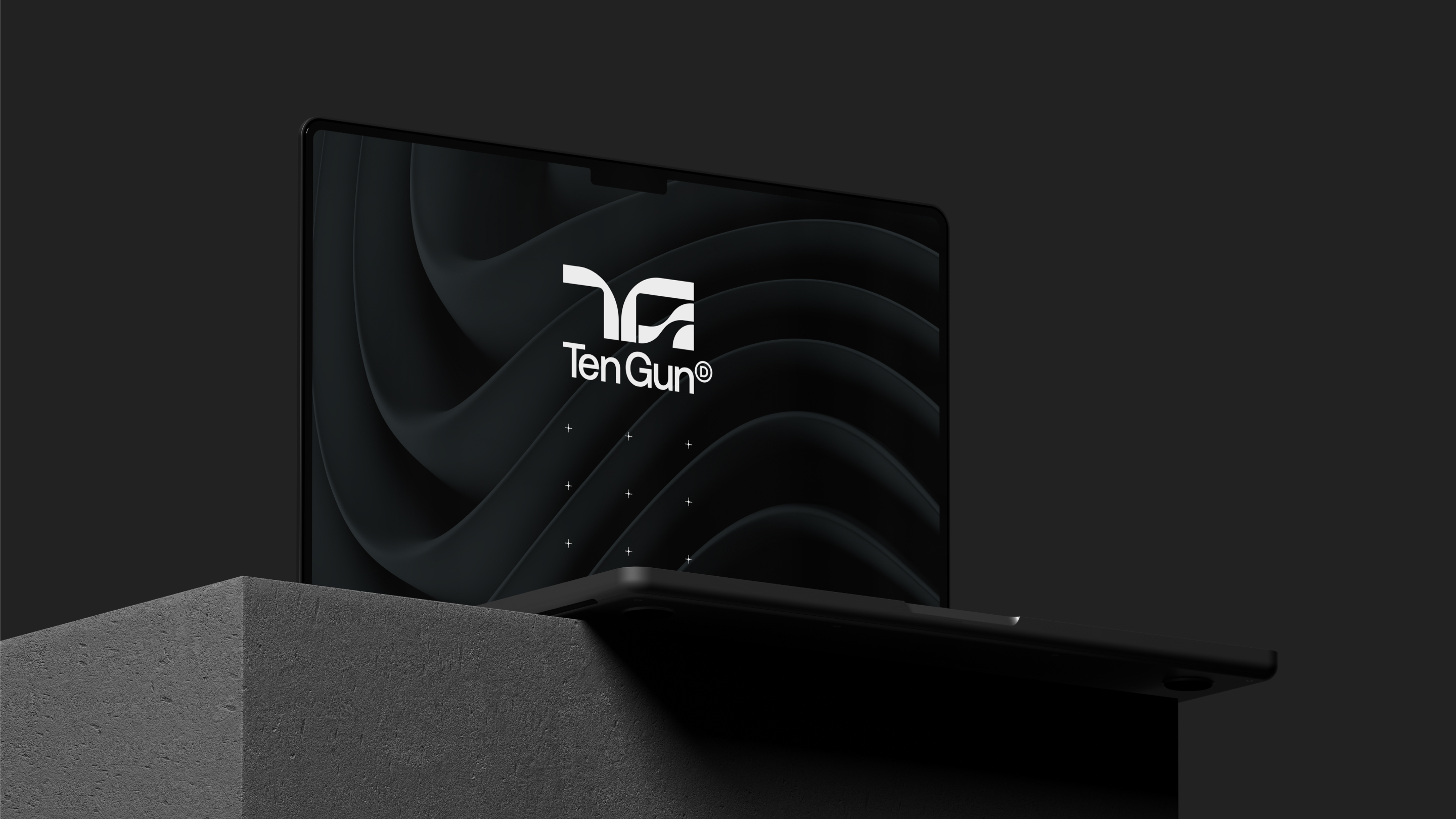
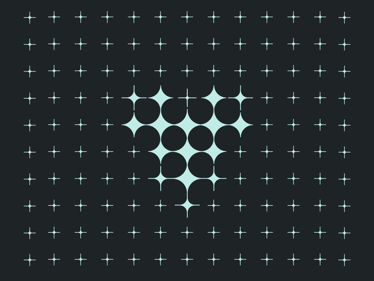
The mark combined a suggested TG with a wave rising through its counterspace. Broad geometric forms gave it weight, while the wave introduced movement—a reference to the agency’s creative energy. Its curves, cuts and counterspaces were aligned to a grid, then refined as a whole. The wave and the geometry used to construct the mark carried into the wider design language. Wave patterns introduced movement, coordinate grids echoed its construction and a denser wave texture became a treatment for highlighting words.
The mark combined a suggested TG with a wave rising through its counterspace. Broad geometric forms gave it weight, while the wave introduced movement—a reference to the agency’s creative energy. Its curves, cuts and counterspaces were aligned to a grid, then refined as a whole. The wave and the geometry used to construct the mark carried into the wider design language. Wave patterns introduced movement, coordinate grids echoed its construction and a denser wave texture became a treatment for highlighting words.
The mark combined a suggested TG with a wave rising through its counterspace. Broad geometric forms gave it weight, while the wave introduced movement—a reference to the agency’s creative energy. Its curves, cuts and counterspaces were aligned to a grid, then refined as a whole. The wave and the geometry used to construct the mark carried into the wider design language. Wave patterns introduced movement, coordinate grids echoed its construction and a denser wave texture became a treatment for highlighting words.
The mark combined a suggested TG with a wave rising through its counterspace. Broad geometric forms gave it weight, while the wave introduced movement—a reference to the agency’s creative energy. Its curves, cuts and counterspaces were aligned to a grid, then refined as a whole. The wave and the geometry used to construct the mark carried into the wider design language. Wave patterns introduced movement, coordinate grids echoed its construction and a denser wave texture became a treatment for highlighting words.
Image Strip
None
Full Flood
framed
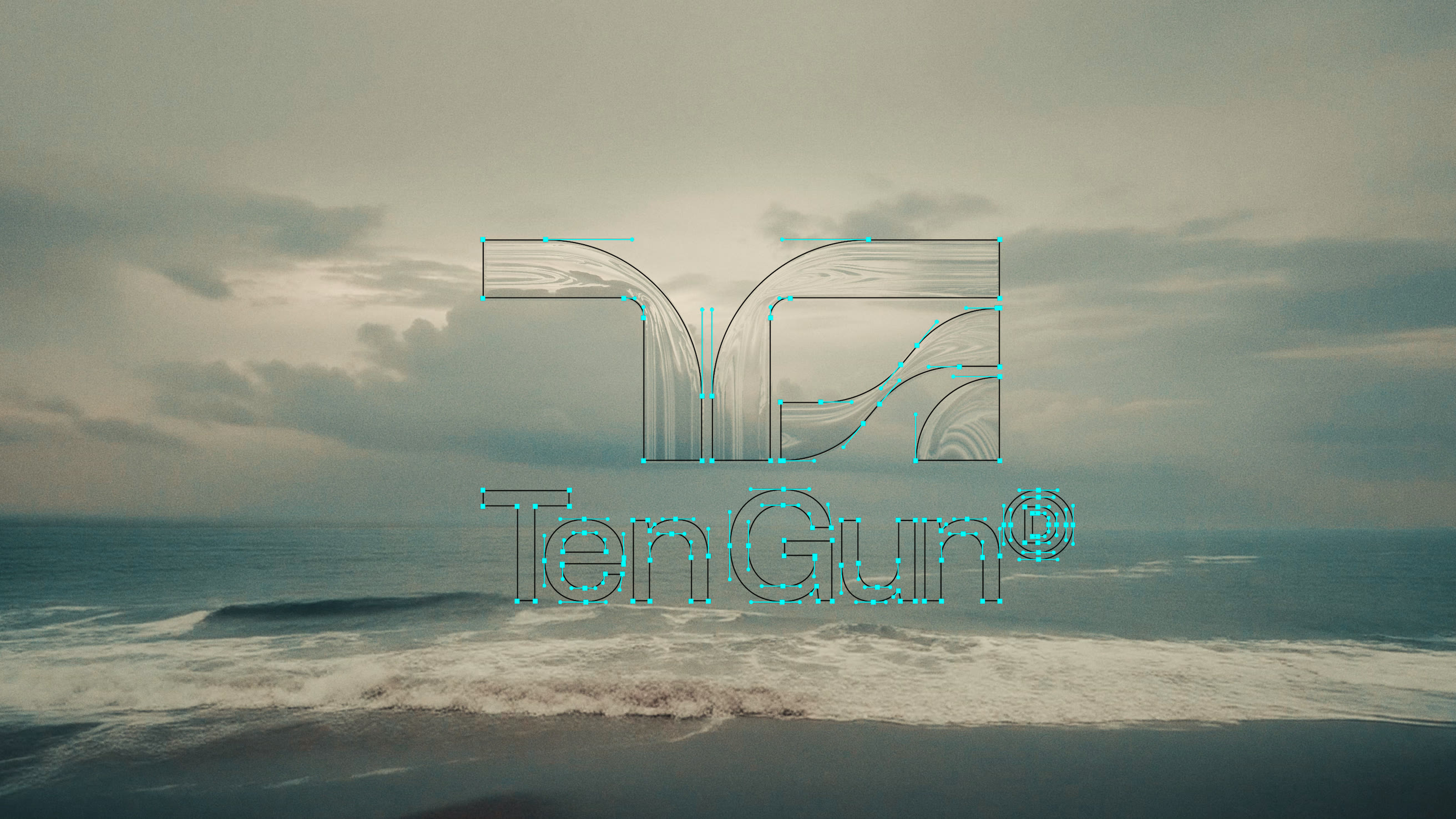
Image Strip
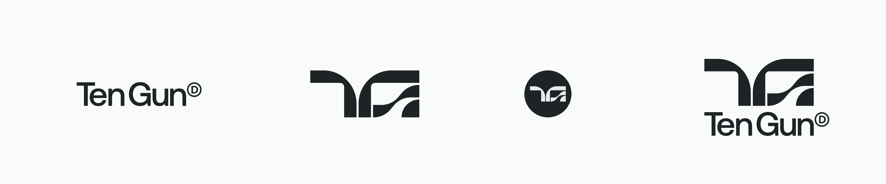
Image Strip
None
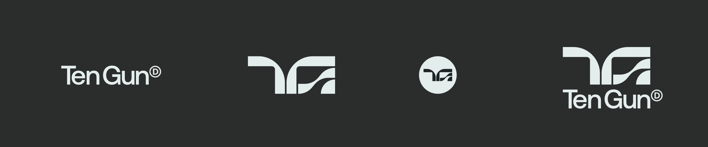
Image + Copy
Right
None
#C0ECE6
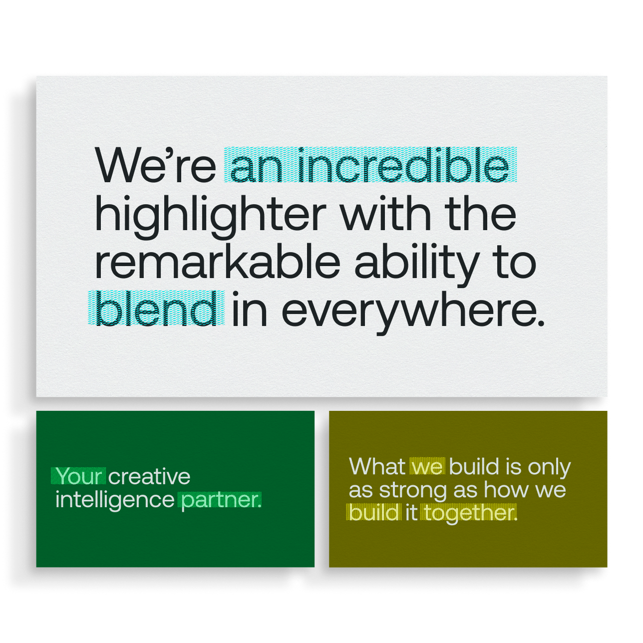
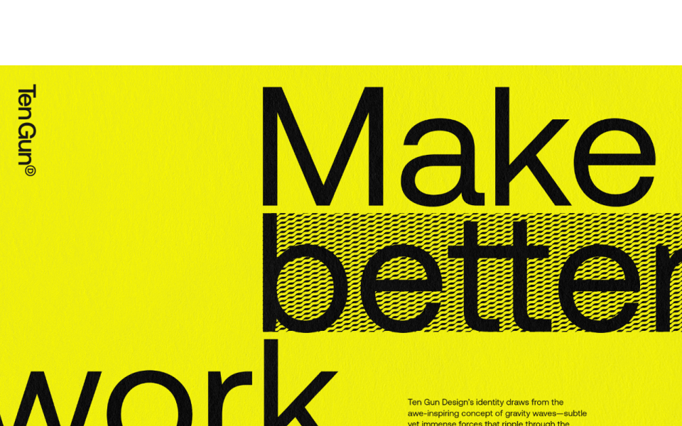
A highlighter treatment borrowed the appearance of redacted copy to reveal rather than conceal. We called it “high-daction.” I wrote lines that could be read two ways: as a complete statement and as a shorter thought picked out by the pattern.
A highlighter treatment borrowed the appearance of redacted copy to reveal rather than conceal. We called it “high-daction.” I wrote lines that could be read two ways: as a complete statement and as a shorter thought picked out by the pattern.
A highlighter treatment borrowed the appearance of redacted copy to reveal rather than conceal. We called it “high-daction.” I wrote lines that could be read two ways: as a complete statement and as a shorter thought picked out by the pattern.
A highlighter treatment borrowed the appearance of redacted copy to reveal rather than conceal. We called it “high-daction.” I wrote lines that could be read two ways: as a complete statement and as a shorter thought picked out by the pattern.
Feature Copy
Center
None

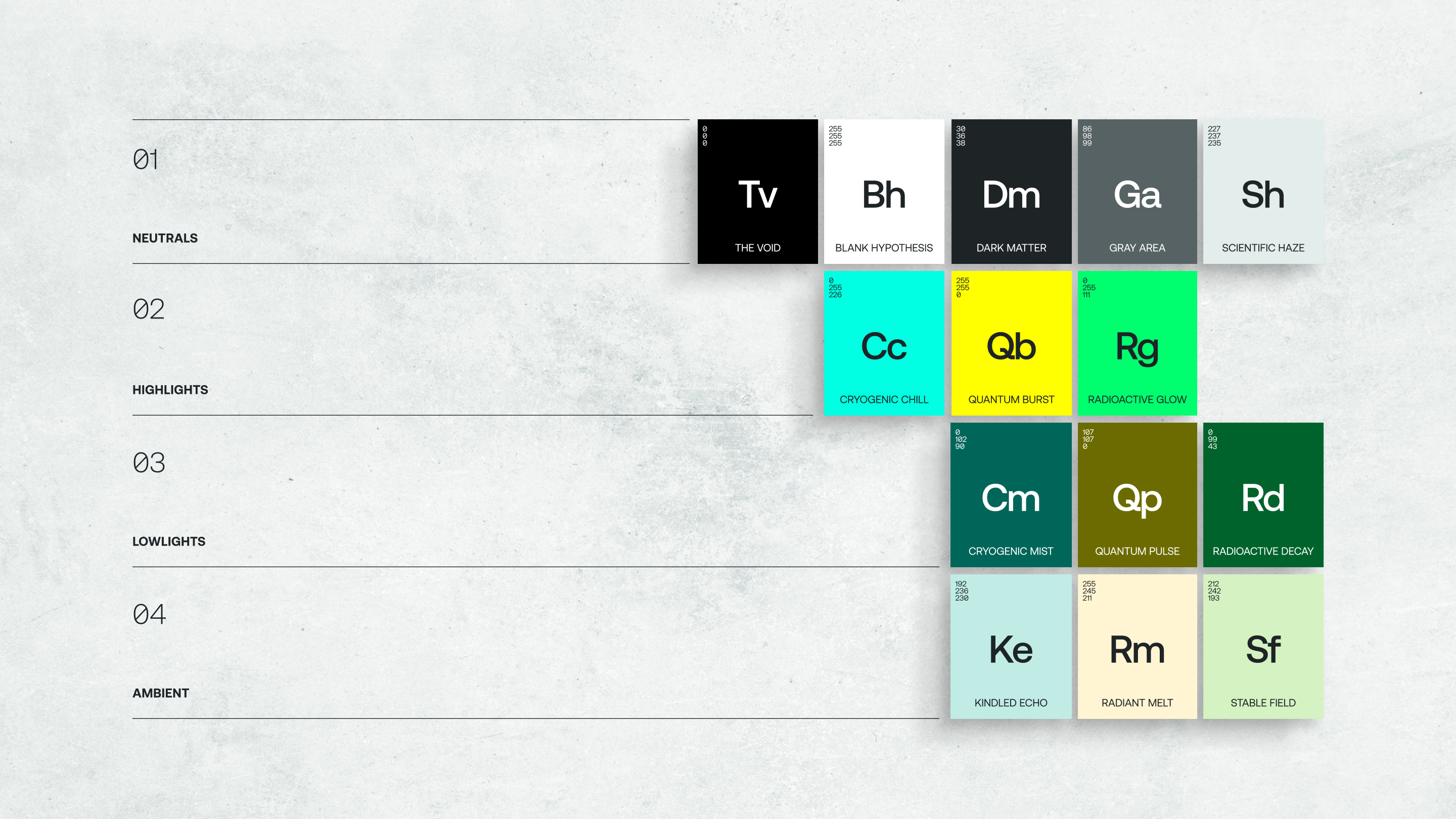
A periodic table organized the palette by role. Neutrals gave client work the room it needed to take center stage. Highlights drew attention and lowlights added weight and contrast. Pastel ambient tones offered a softer expression without returning to neutral.
A periodic table organized the palette by role. Neutrals gave client work the room it needed to take center stage. Highlights drew attention and lowlights added weight and contrast. Pastel ambient tones offered a softer expression without returning to neutral.
A periodic table organized the palette by role. Neutrals gave client work the room it needed to take center stage. Highlights drew attention and lowlights added weight and contrast. Pastel ambient tones offered a softer expression without returning to neutral.
A periodic table organized the palette by role. Neutrals gave client work the room it needed to take center stage. Highlights drew attention and lowlights added weight and contrast. Pastel ambient tones offered a softer expression without returning to neutral.
Full Flood
None
Full Flood
None
Full Flood
None
2Up
Full Flood
framed
Tight
Full Flood
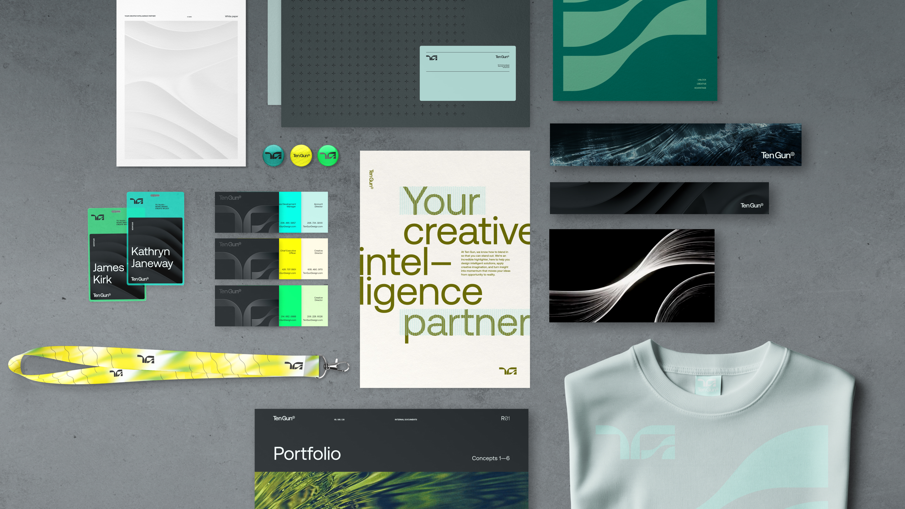
Image Strip
None
Swipe Center
2Up Copy
None
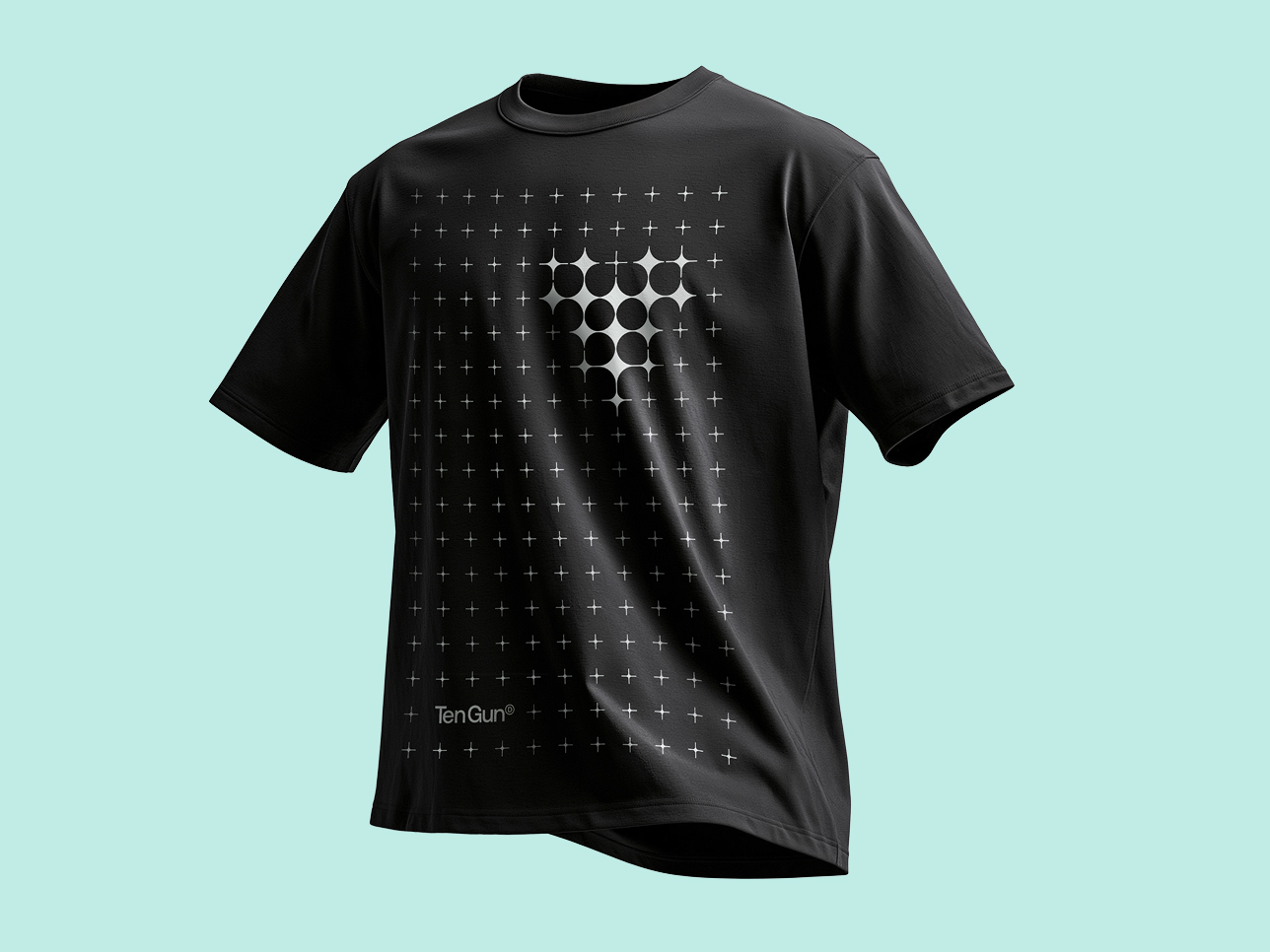
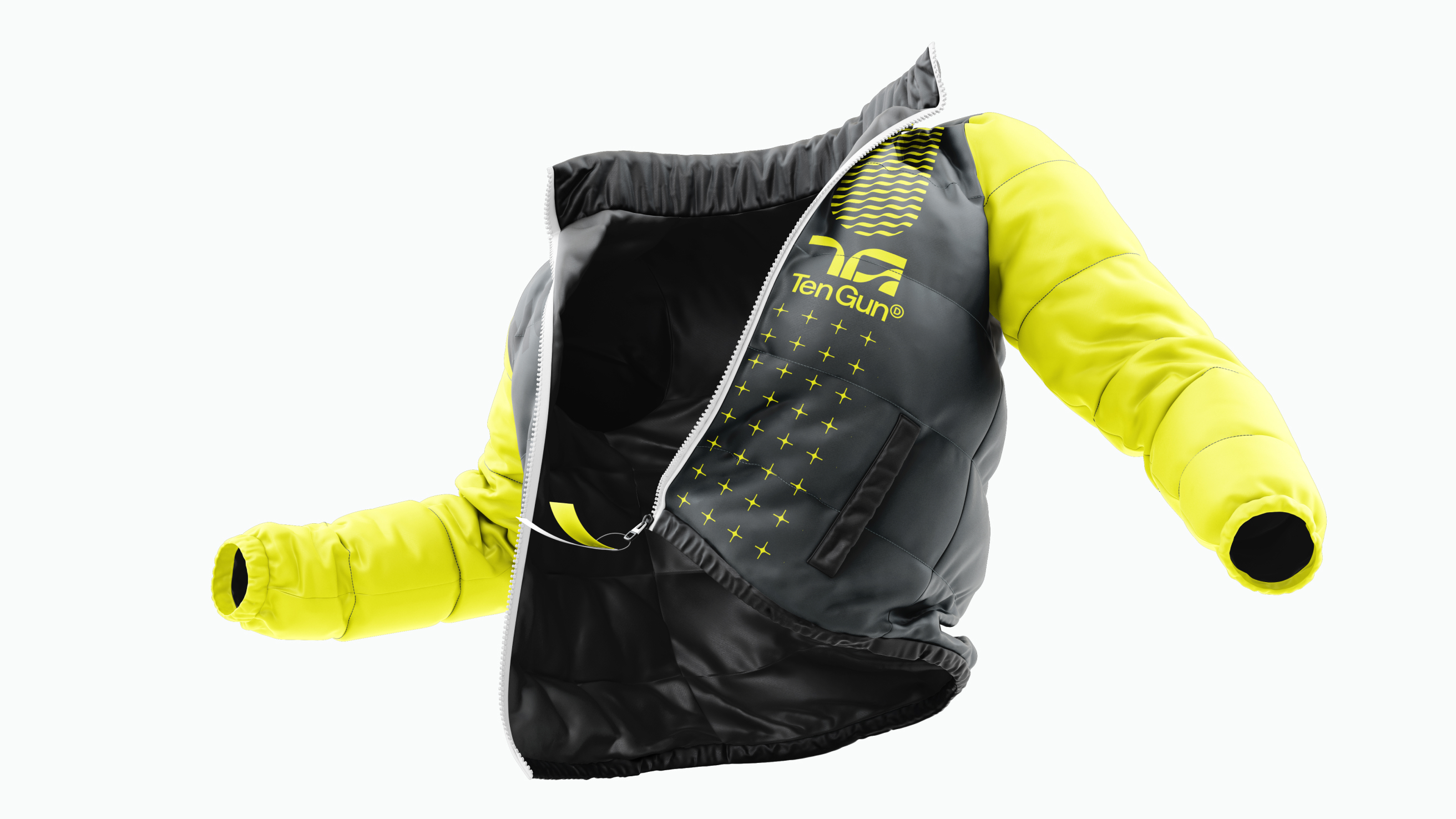
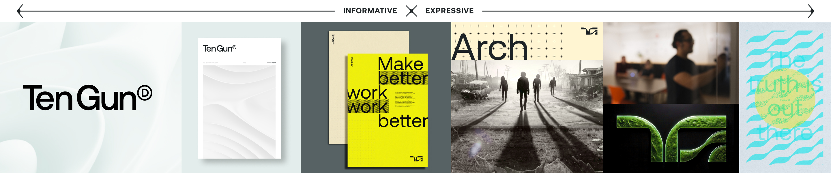
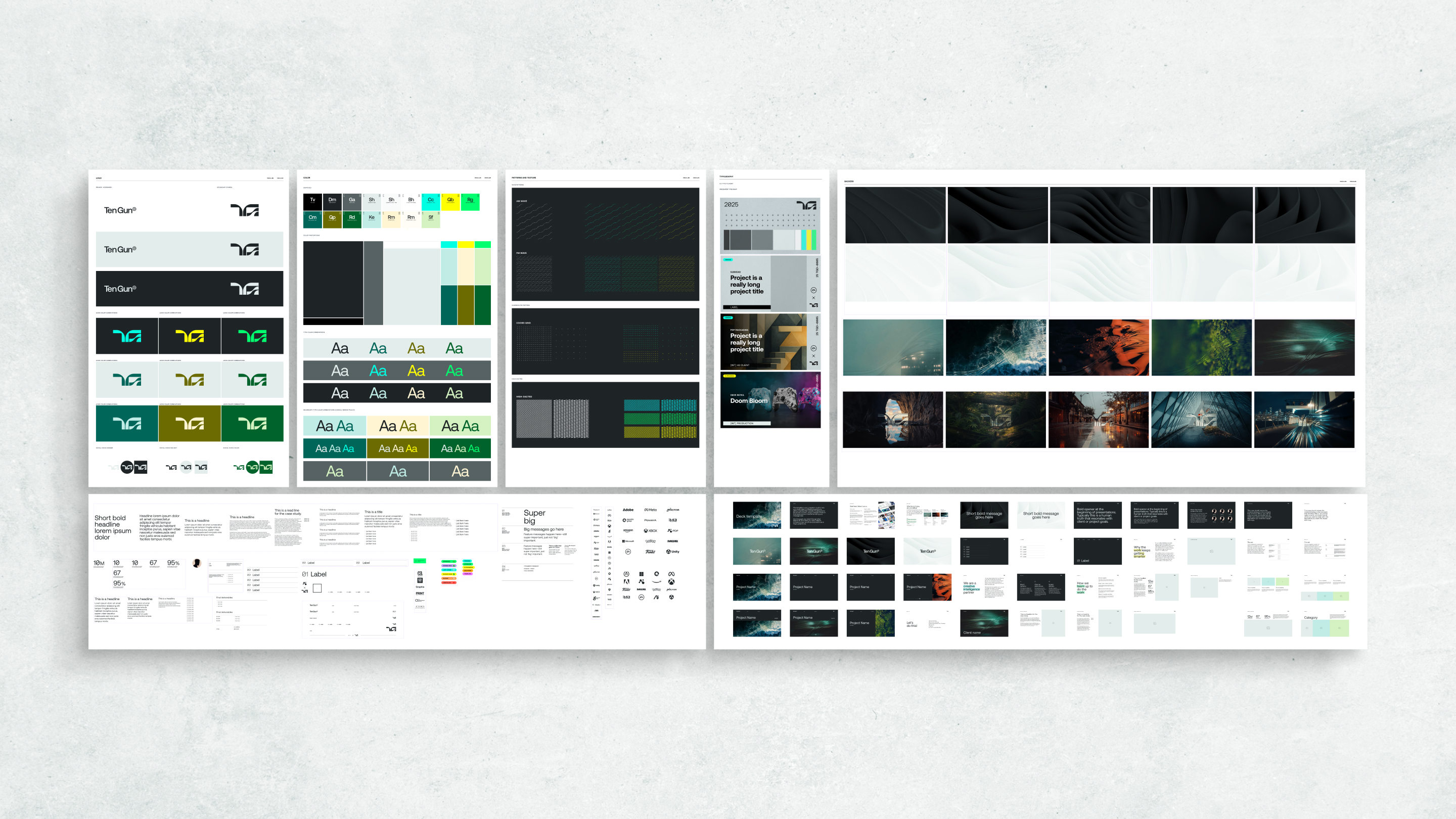
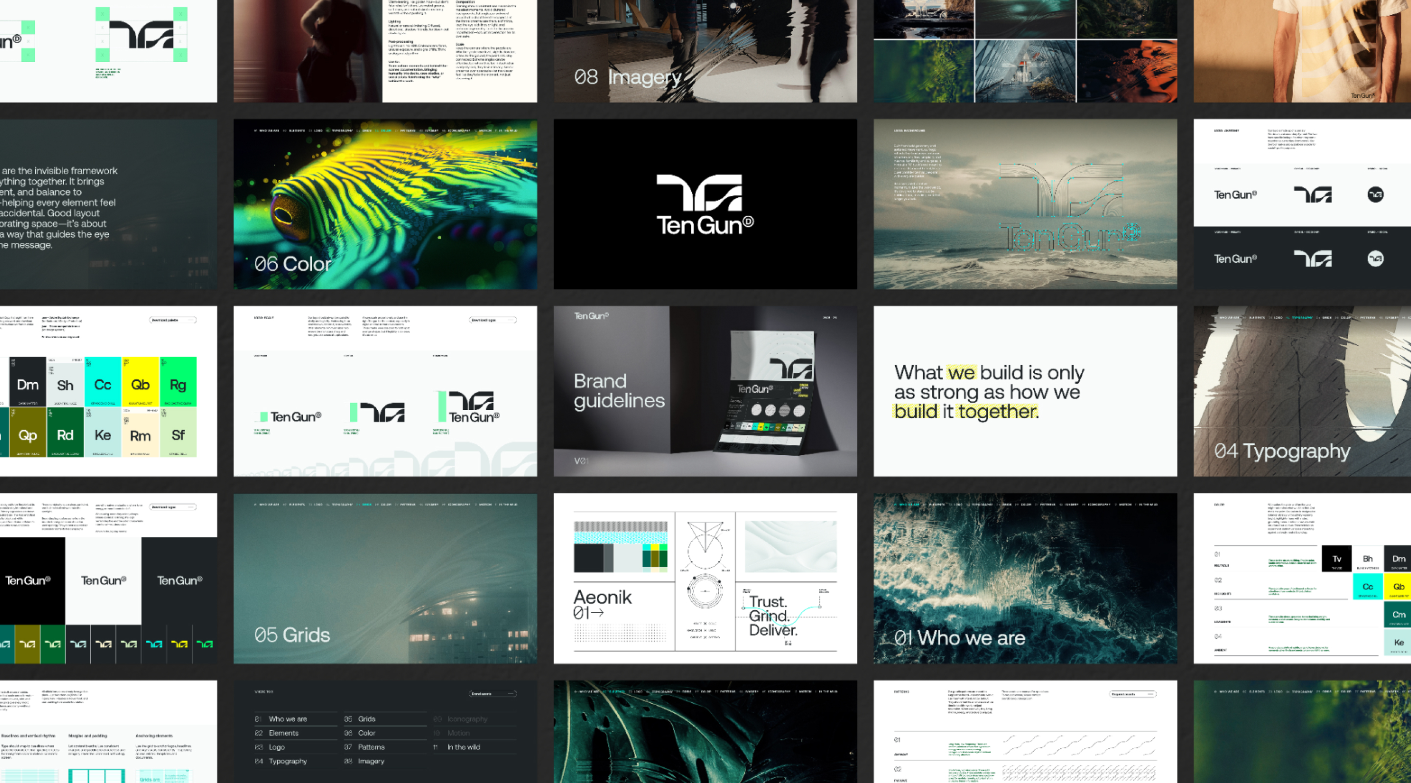
A spectrum from informative to expressive helped people judge how much of the identity a situation called for. Client presentations kept the agency’s presence quiet, while company merch and social communications had room for richer patterns, imagery and layers. Experienced designers could push the language further; those who needed a starting point had examples and guidance to follow.
A spectrum from informative to expressive helped people judge how much of the identity a situation called for. Client presentations kept the agency’s presence quiet, while company merch and social communications had room for richer patterns, imagery and layers. Experienced designers could push the language further; those who needed a starting point had examples and guidance to follow.
A spectrum from informative to expressive helped people judge how much of the identity a situation called for. Client presentations kept the agency’s presence quiet, while company merch and social communications had room for richer patterns, imagery and layers. Experienced designers could push the language further; those who needed a starting point had examples and guidance to follow.
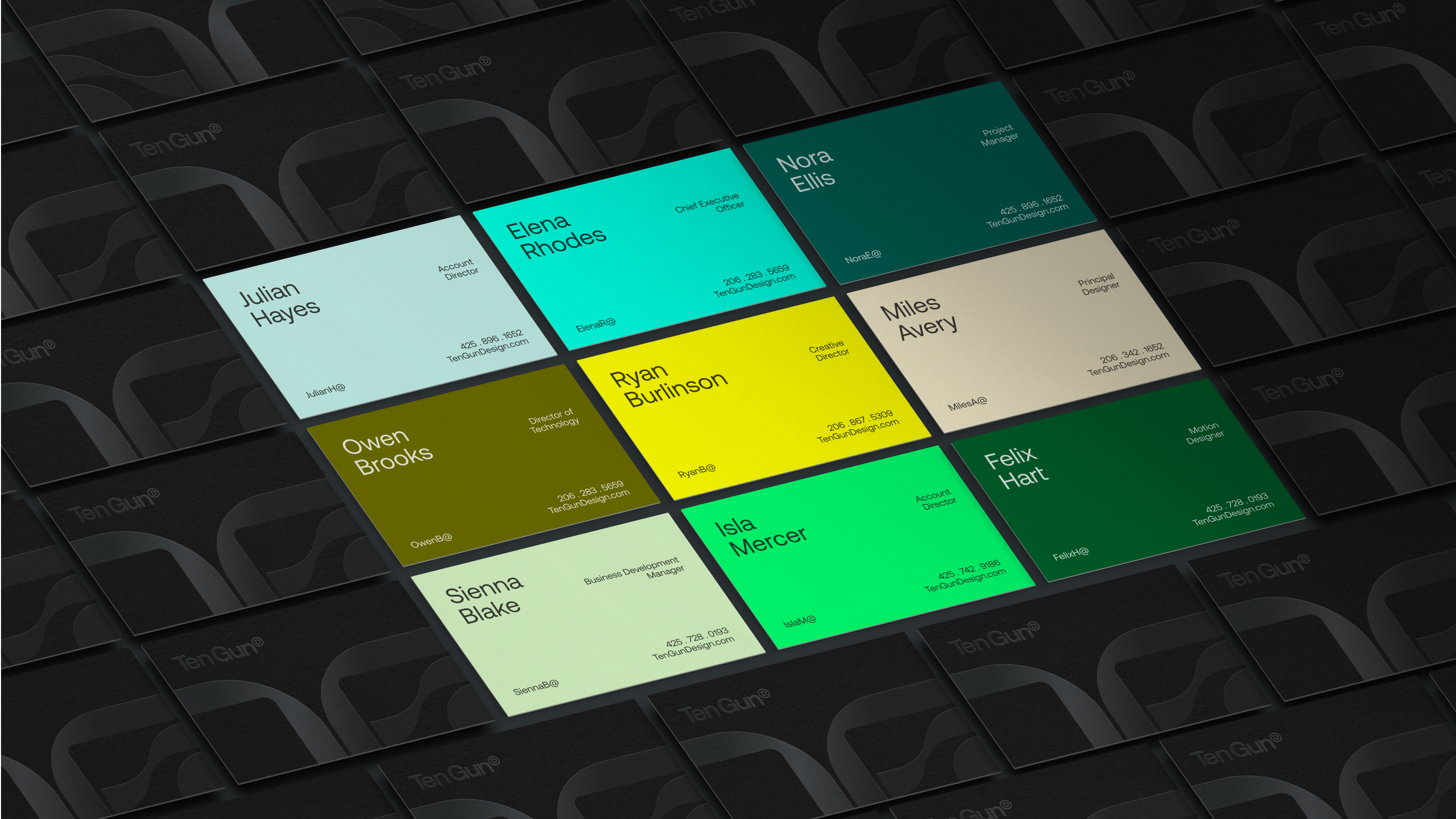
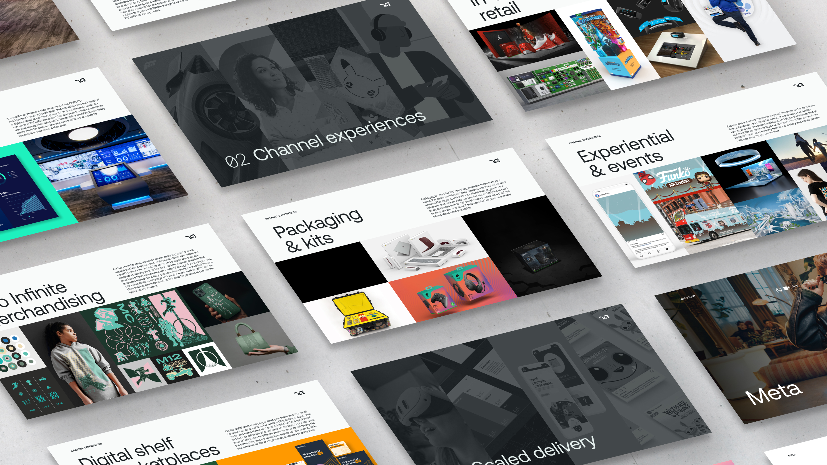
The rollout brought the identity into the tools people already used: shared Figma and Adobe libraries, along with Figma and PowerPoint presentation templates. Layouts, assets and starting copy gave nondesigners a way to build presentations and pitches without assembling everything from scratch.
A spectrum from informative to expressive helped people judge how much of the identity a situation called for. Client presentations kept the agency’s presence quiet, while company merch and social communications had room for richer patterns, imagery and layers. Experienced designers could push the language further; those who needed a starting point had examples and guidance to follow.
Full Flood
None
Full Flood
framed
Full Flood
Full Flood
None
Statement
Large
None

The reveal is the seductive part.
The reveal is the seductive part.
The reveal is the seductive part.
Image + Copy
Left
None
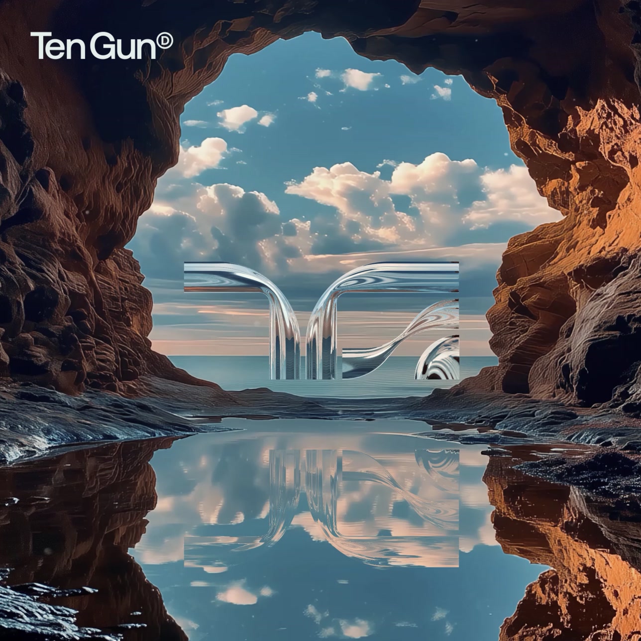
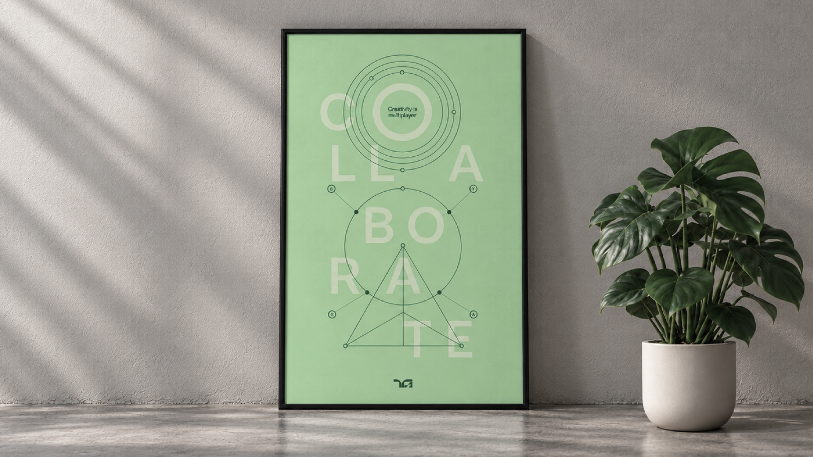
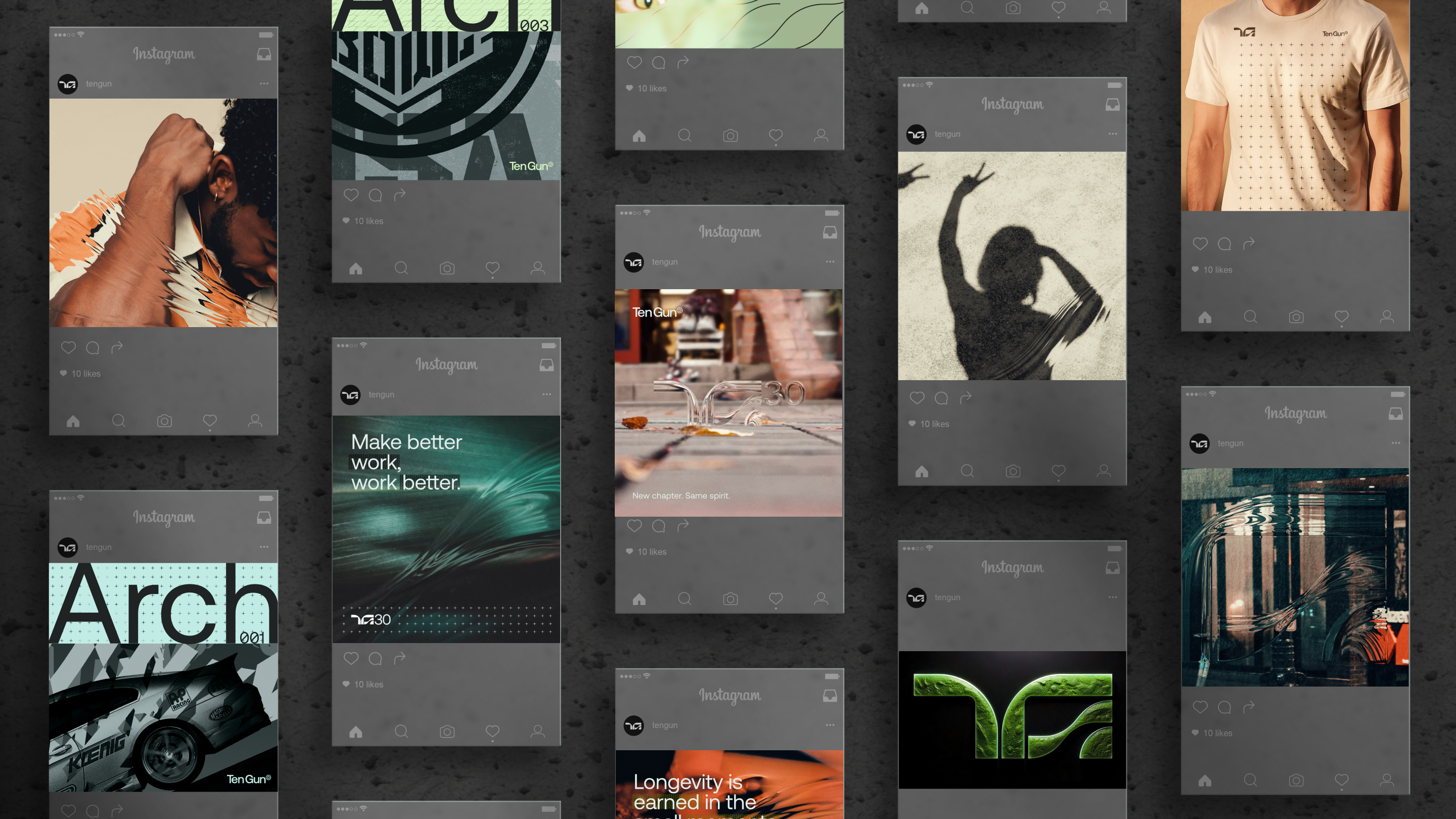
Thought leadership pieces drew on the company’s accumulated knowledge over 30 years. I used the identity’s more expressive range to build a five-week campaign introducing the rebrand. The right crop and polished mockups with carefully placed cast shadows can make almost any identity feel inevitable. And I love that moment. Probably too much.
But the real test begins after the reveal, in the hands of everyone who has to make something with it. The guidance, libraries and tools were built with those people in mind—and a simple standard: Make better work, work better.
Full Flood
None


funko