70
50
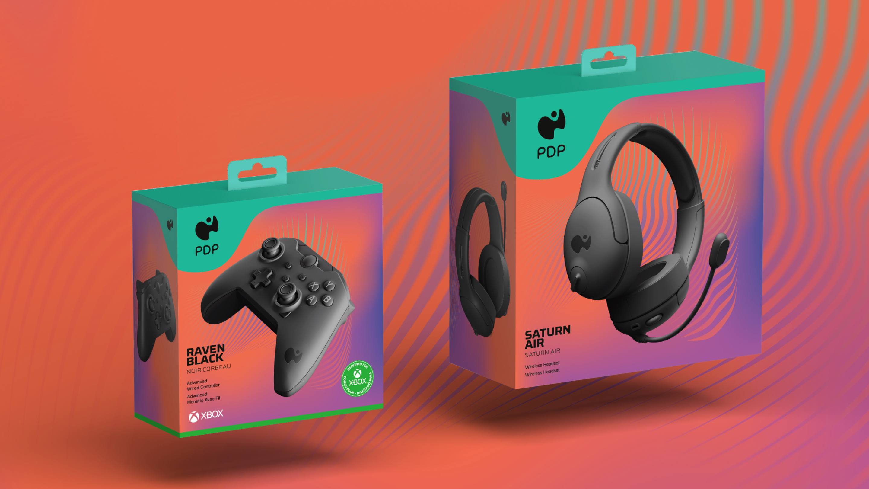
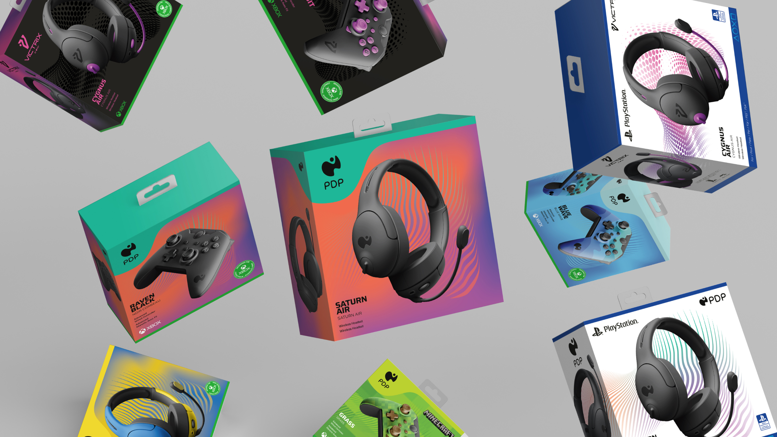
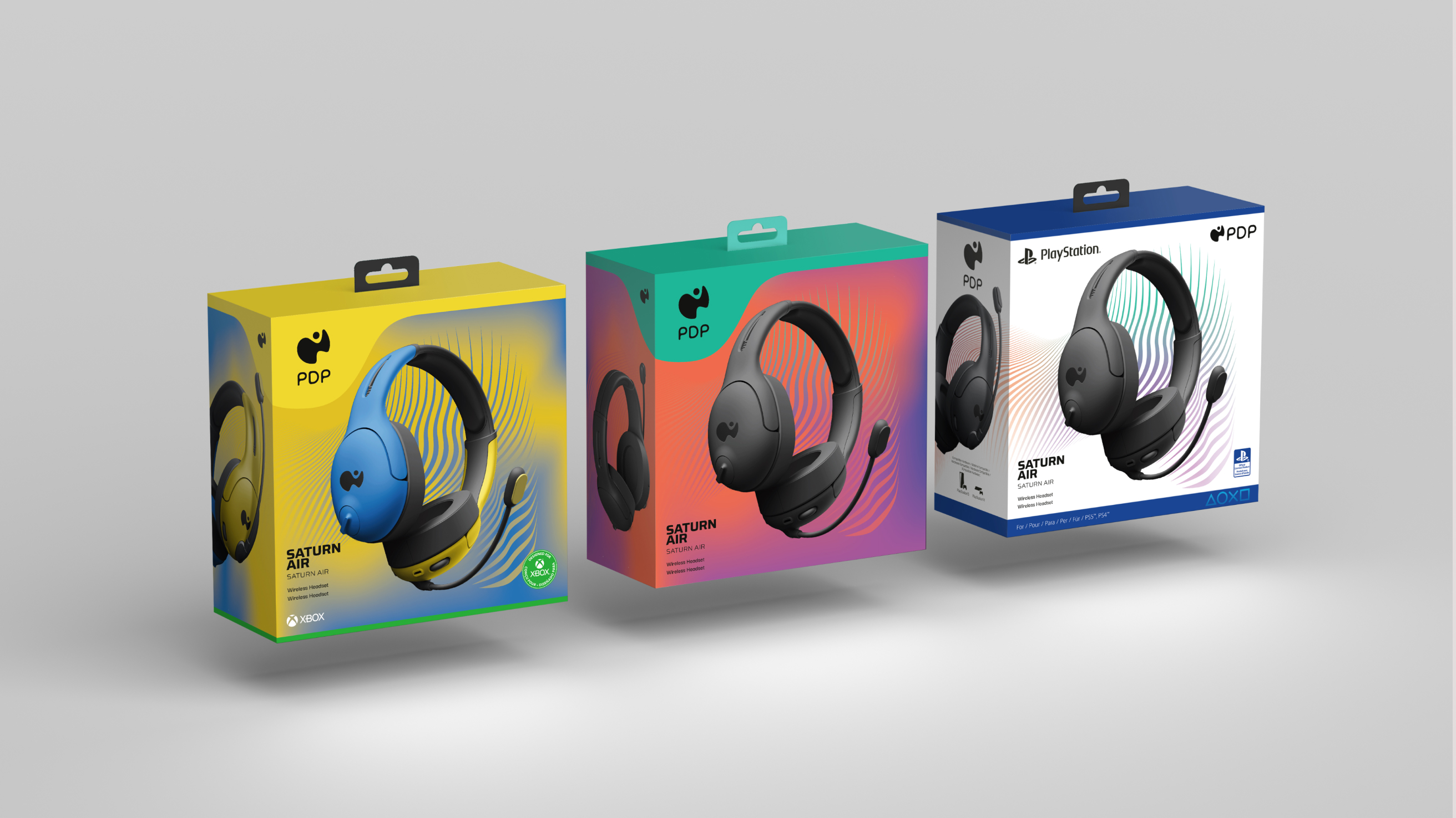
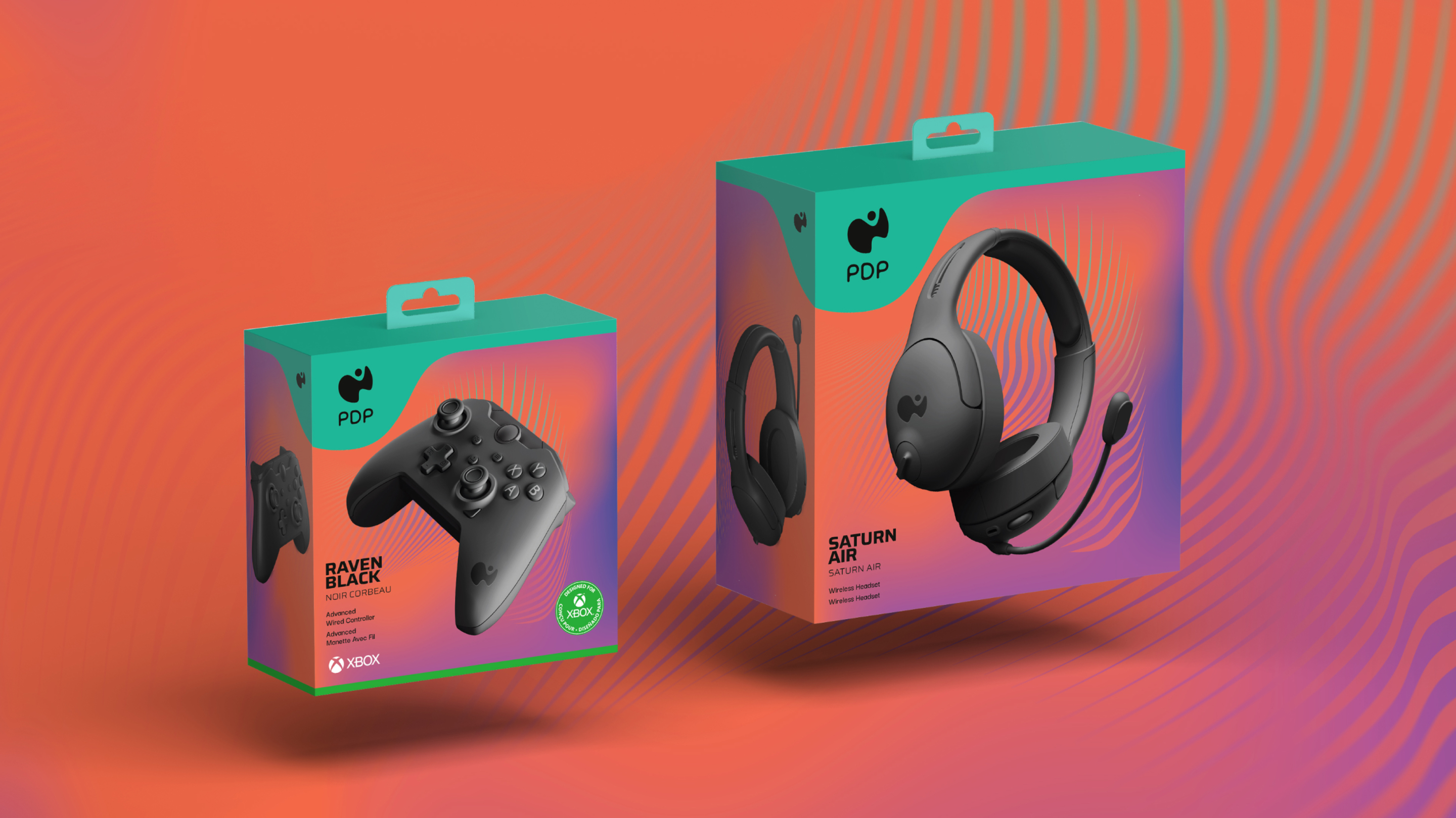
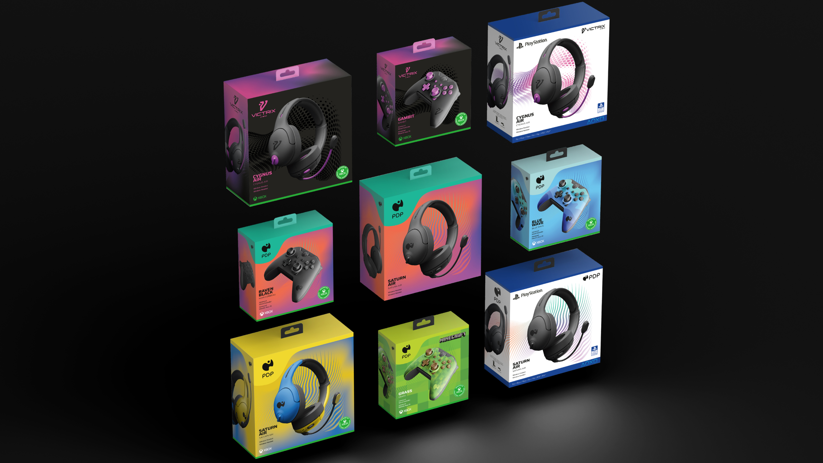
PDP wanted its refreshed brand to stand out on shelf and look premium across Xbox, PlayStation and unlicensed accessories. We established the packaging approach for its base product line and Victrix Gambit, balancing partner requirements with distinctive graphics, product views and a structure PDP could extend into additional colorways.
#27BD9F
Full Flood
framed
1Up Paragraph + Pull Quote
Left
None
Platform branding on accessories comes with rigid requirements. Having worked on Microsoft and Xbox packaging systems, I knew how much those rules could shape the box. PDP and Victrix each needed a recognizable presence within them, while keeping the accessory itself the main attraction. Those relationships had to hold across controllers, headsets and other products.
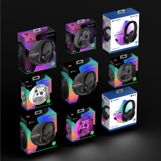
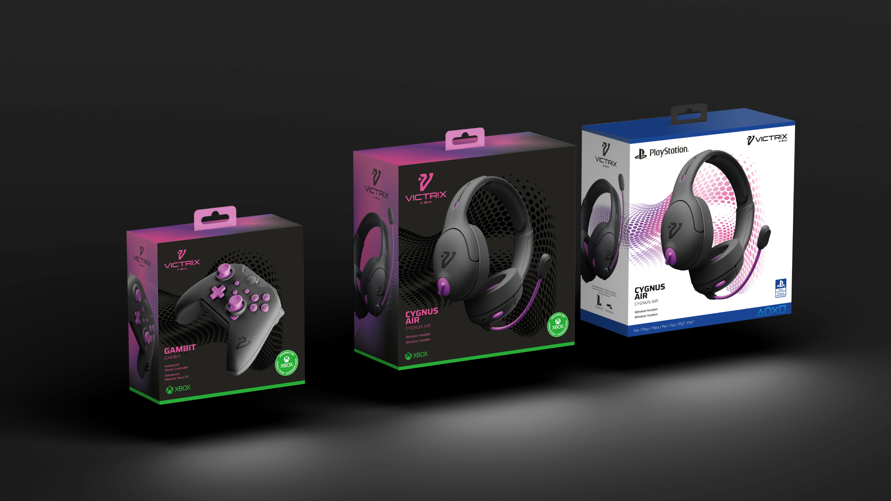
A shared hierarchy organized the branding, product views and information. PDP’s base product line used bright color, gradients and graphic movement. Victrix took a darker approach, with black grounds, purple accents and more restrained patterning. The structure connected the range while allowing each line its own character.
The box had to say, “Pick me up.”
The box had to say, “Pick me up.”
Platform branding on accessories comes with rigid requirements. Having worked on Microsoft and Xbox packaging systems, I knew how much those rules could shape the box. PDP and Victrix each needed a recognizable presence within them, while keeping the accessory itself the main attraction. Those relationships had to hold across controllers, headsets and other products.
A shared hierarchy organized the branding, product views and information. PDP’s base product line used bright color, gradients and graphic movement. Victrix took a darker approach, with black grounds, purple accents and more restrained patterning. The structure connected the range while allowing each line its own character.
The box had to say, “Pick me up.”
Platform branding on accessories comes with rigid requirements. Having worked on Microsoft and Xbox packaging systems, I knew how much those rules could shape the box. PDP and Victrix each needed a recognizable presence within them, while keeping the accessory itself the main attraction. Those relationships had to hold across controllers, headsets and other products.
A shared hierarchy organized the branding, product views and information. PDP’s base product line used bright color, gradients and graphic movement. Victrix took a darker approach, with black grounds, purple accents and more restrained patterning. The structure connected the range while allowing each line its own character.
Full Flood
None
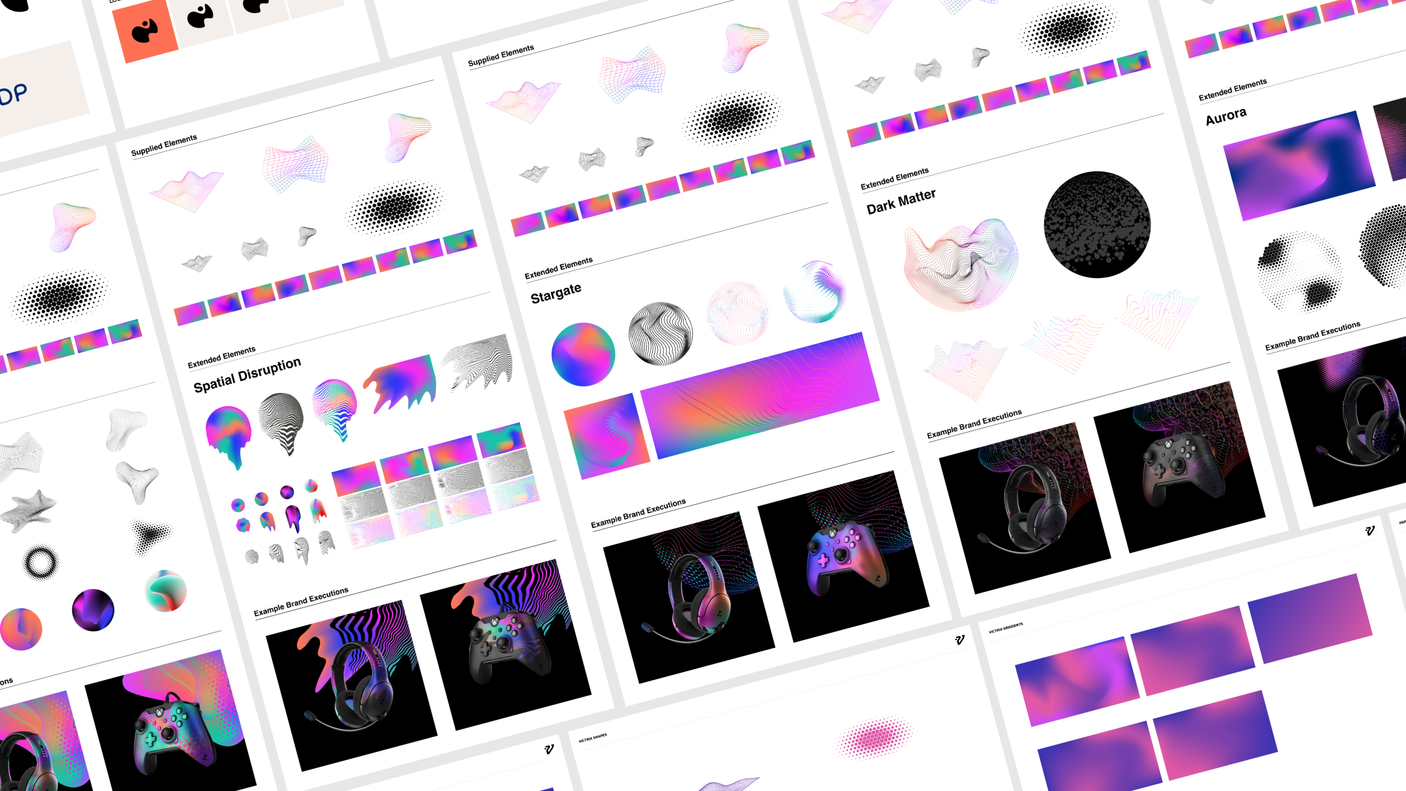
Image + Copy
Left
None

PDP’s base product line had to convey energy, excitement and quality through graphics alone. Color, pattern, product imagery and composition carried that impression within the existing packaging budget.
Victrix called for a quieter confidence. Darker backgrounds and concentrated purple accents gave the pro line a distinct expression, with spot varnish considered to bring out the pattern through a change in sheen.
Full Flood
None
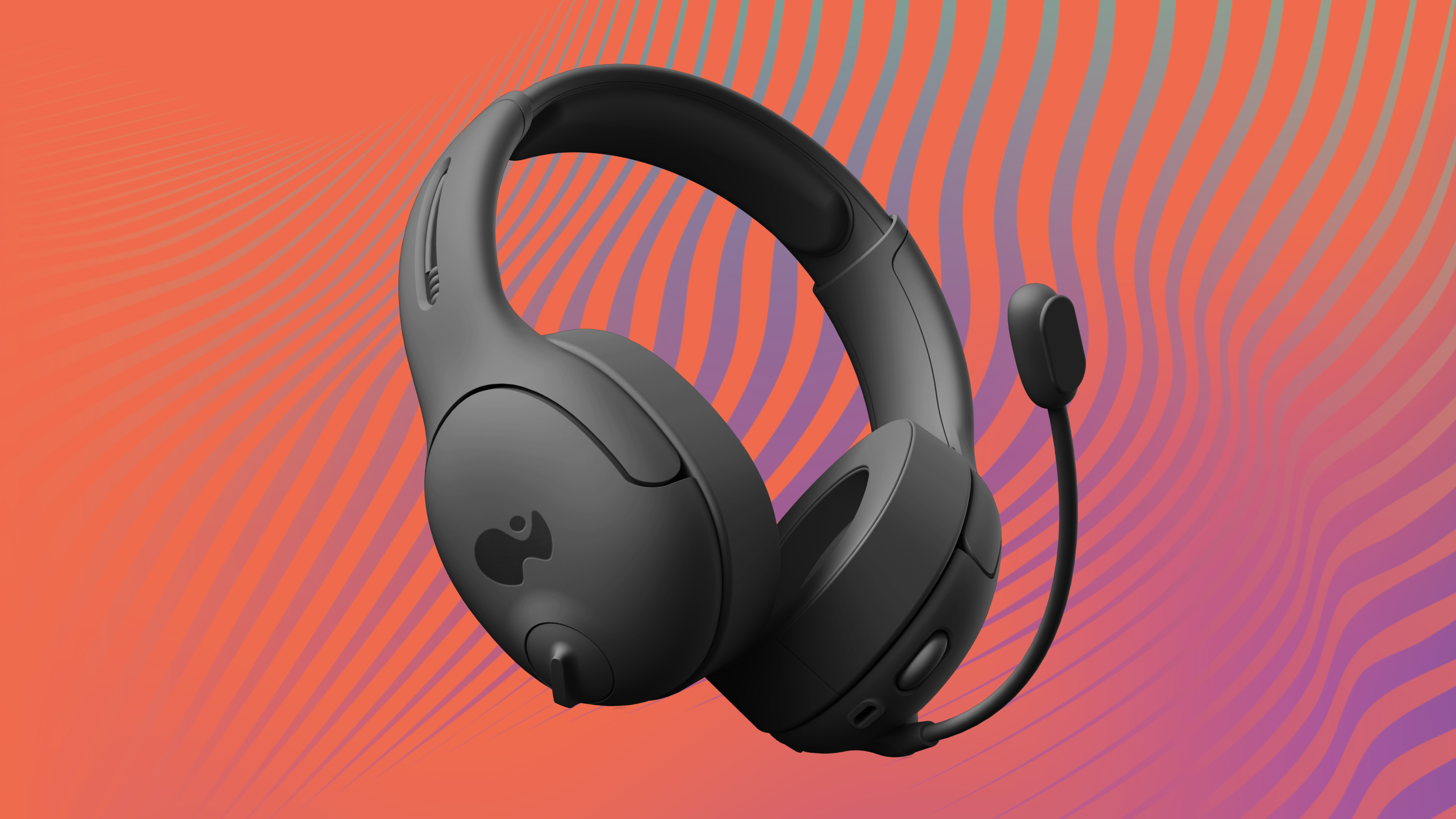
Image + Copy
Right
None
The product views needed to show off the accessories and fit the packaging compositions. We used placeholder renders to demonstrate angles that did both, giving PDP guidance for developing its imagery.
Those views helped establish how each product would sit within the system, with enough room for the graphics, branding and information around it.
Full Flood
framed
None
Full Flood
2Up Copy
None
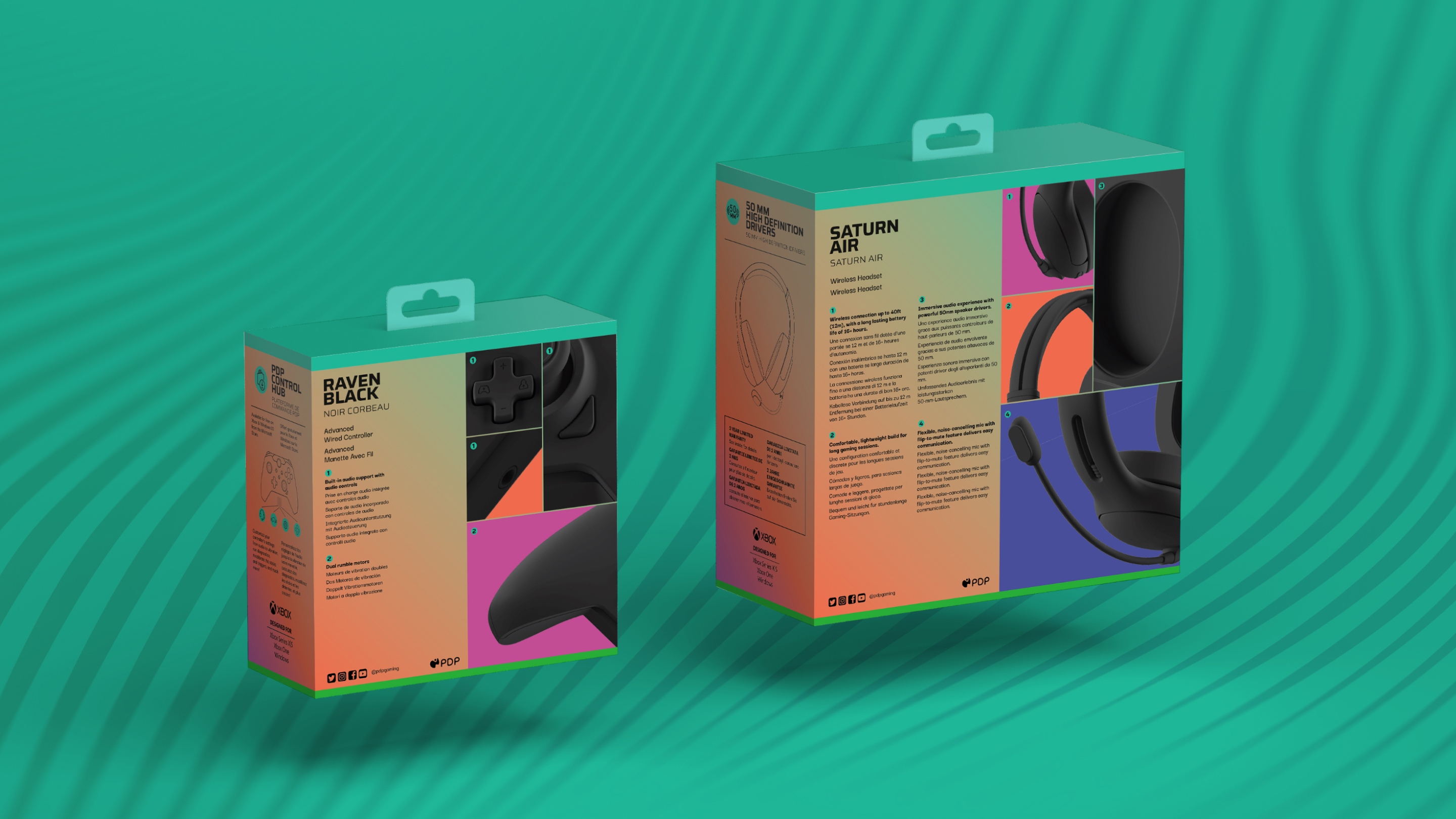
The back of the box used a flexible, numbered grid to connect product features with short descriptions in multiple languages. Close-up crops highlighted specific details, with corresponding numbers linking them to the copy.
The back of the box used a flexible, numbered grid to connect product features with short descriptions in multiple languages. Close-up crops highlighted specific details, with corresponding numbers linking them to the copy.
The back of the box used a flexible, numbered grid to connect product features with short descriptions in multiple languages. Close-up crops highlighted specific details, with corresponding numbers linking them to the copy.
PDP could change the features and imagery for each accessory while keeping the layout consistent. The front gave the product its presence; the back made room for a closer look.
The back of the box used a flexible, numbered grid to connect product features with short descriptions in multiple languages. Close-up crops highlighted specific details, with corresponding numbers linking them to the copy.
Statement
Large
None

Victrix called for a quieter confidence.
Victrix called for a quieter confidence.
Victrix called for a quieter confidence.
Full Flood
Full Flood


ten-gun